Gotta Grid'em All
How strategic gridline design can transform chart comprehension by revealing hidden data relationships and providing meaningful context at a glance.
Overview
Data visualization is often approached as a technical exercise: plot the data, add axes, maybe throw in some gridlines, and call it done. But the most effective visualizations go beyond mere accuracy—they guide the viewer's attention and reveal patterns that raw data alone cannot communicate.
This project explores a deceptively simple question: what if we rethought the humble gridline? Instead of the standard horizontal and vertical lines that serve as mere measurement aids, what if background patterns could themselves encode meaning and highlight relationships within the data?
The Concept
Traditional gridlines serve a single purpose: helping viewers estimate values along each axis. They're utilitarian—functional but uninspired. Yet the background of a chart represents valuable real estate that could communicate more than just measurement scales.
The core insight is that gridline orientation and distribution can highlight meaningful data relationships. Rather than defaulting to perpendicular lines aligned with axes, we can strategically position lines to represent:
- •Aggregate metrics (like sums or ratios of two variables)
- •Percentile groupings or statistical bands
- •Natural clustering boundaries in the data
- •Domain-specific thresholds or reference points
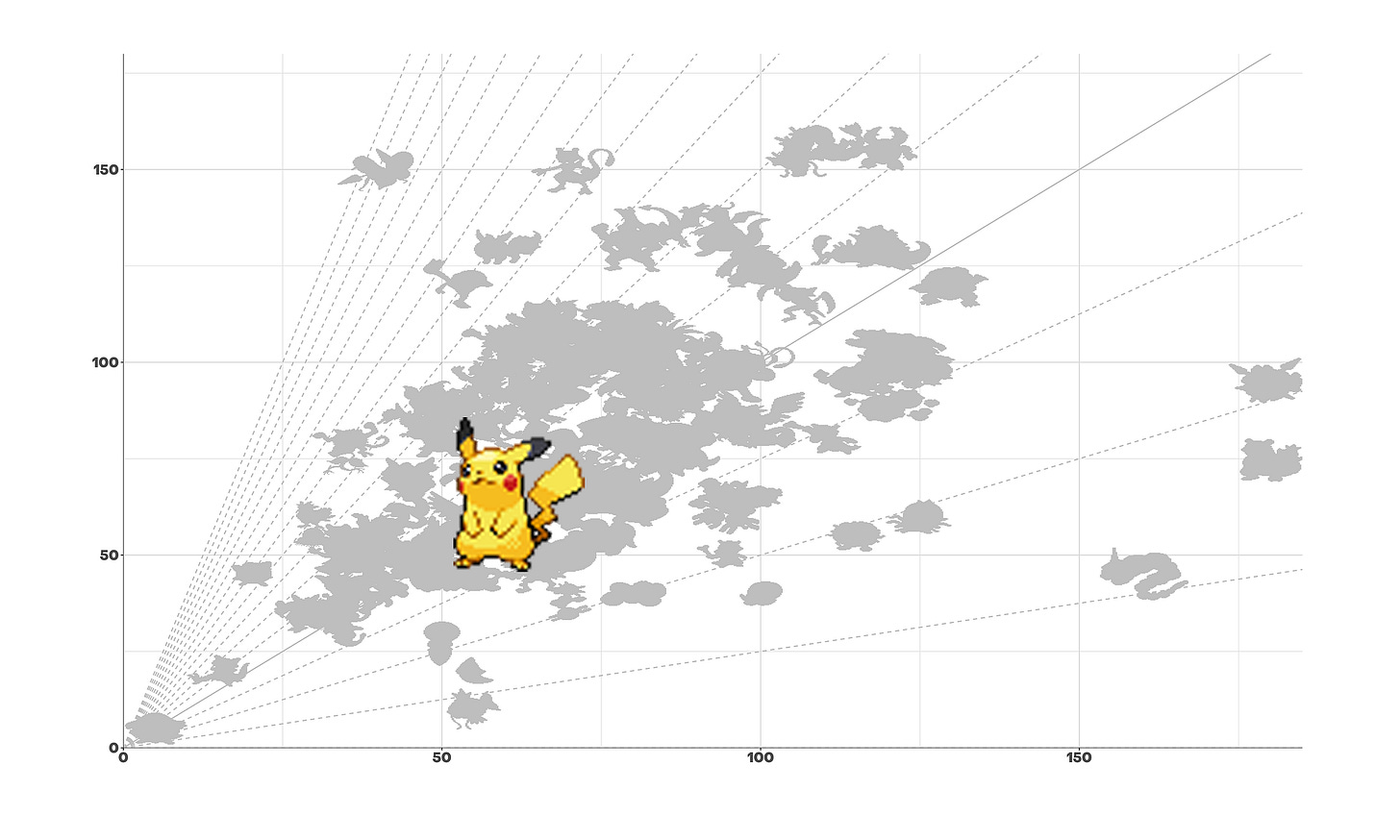
Case Study: Pokémon Battle Stats
To demonstrate this approach, I analyzed Pokémon battle statistics—specifically the relationship between Attack and Defense values across different Pokémon species.
The Standard Approach
A conventional scatter plot with standard horizontal/vertical gridlines shows the distribution but requires mental arithmetic to identify Pokémon with similar total combat stats (Attack + Defense).
The Enhanced Approach
By replacing vertical/horizontal lines with diagonal parallel lines representing constant Attack+Defense sums, the chart immediately reveals power tiers. Pokémon falling along the same diagonal line share similar total combat stats, making it trivial to identify balanced fighters versus specialized attackers or defenders.
Result: Viewers can instantly grasp both individual stats AND aggregate power level without additional cognitive load.
Technical Implementation
The approach translates cleanly into Python using Matplotlib, where custom gridline generation offers precise control over positioning and styling.
Line Distribution
Lines can be distributed using regular intervals, percentiles, or domain-specific clustering. Percentile-based distribution ensures even visual density across the data range.
Visual Hierarchy
Subtle styling—muted colors, low opacity, fine line weights—ensures gridlines support rather than dominate the data. The background should guide, not distract.
Contextual Labeling
Strategic annotation of key gridlines helps viewers understand what the patterns represent without requiring deep analysis or legend consultation.
Matplotlib Integration
Custom gridline generation integrates seamlessly with existing plotting workflows, requiring minimal code changes to adopt the technique.
Design Principles
Encode Meaning, Not Just Measurement
Every visual element should serve a purpose beyond decoration. If gridlines can reveal relationships, they become analytical tools rather than passive reference marks.
Reduce Cognitive Load
Effective visualization minimizes the mental effort required to extract insights. Strategic gridlines allow patterns to emerge naturally without forcing viewers to perform calculations or comparisons manually.
Context Over Precision
Not every chart needs to support precise value reading. When the goal is understanding relationships, patterns, or distributions, contextual gridlines can be more valuable than measurement accuracy.
Subtlety is Strength
The best gridlines fade into the background until needed. They should guide attention without demanding it, supporting the data story rather than competing for focus.
Practical Applications
This approach extends beyond Pokémon stats to any bivariate analysis where aggregate metrics or relationships matter:
- •Financial Analysis: Revenue vs. costs with iso-profit lines revealing margin bands
- •Performance Metrics: Speed vs. accuracy trade-offs with iso-performance curves
- •Resource Allocation: Time vs. cost with iso-budget lines showing feasible combinations
- •Scientific Data: Any X-Y relationship where sum, ratio, or product has domain significance
Impact & Insights
This exploration reinforces a fundamental principle: effective visualization is about thoughtful design choices, not just technical execution. The same data can tell dramatically different stories depending on how we choose to frame it.
By questioning default conventions—like standard perpendicular gridlines—we open up opportunities to create more insightful, contextual visualizations. The technique is simple to implement yet powerful in impact, requiring no specialized tools or complex algorithms.
The positive response from the data visualization community on Substack confirmed that even experienced practitioners appreciate fresh perspectives on foundational elements. Sometimes the most impactful innovations come from rethinking the basics rather than chasing complexity.
Tools & Technologies
Interested in the full article?
Read the complete case study with code examples on Substack.